Topic: Are residents of lower income neighborhoods in rustbelt cities more likely to have greater access to fast food and less access to parks compared to residents of higher income neighborhoods?
For this analysis, I include Baltimore, Buffalo, Cleveland, Detroit, and Pittsburgh as “rust belt cities.” For comparison, I also include Philadelphia as a traditional/former working class city that is not typically included within the rust belt.
Often the most challenging part of a GIS analysis is sourcing the data and displaying it on the map. This post follows the steps I took to accomplish those goals. A later post will focus on the analysis.
Data and Sources
Parks
Geometry: Polygon
Source: Protected Areas Database (PAD-US) from US Geological Survey
Fast Food Restaurants
Geometry: Point
Source: OpenStreetMap (OSM)
City/County Boundaries
Geometry: Polygon
Source: U.S. Census Bureau TIGER/Line Shapefiles
Income
Geometry: Polygon
Source: U.S. Census Bureau
Data Transformations
Fast Food Restaurants: OSM data is available as a GeoJSON file, which is not directly recognizable by ArcGIS. Before posting it to the map, I converted the data to point features shapefile using Geoprocessing-JSON to Features from the ArcGIS toolkit
US Income Data: Each of the Census income tracts is located in a separate file. Instead of downloading each income tract individually, I wrote a Python script to iterate through the files, download the income data, and save it to a GeoJSON file, using a Census API.

Once I had my GeoJSON file, I converted the data to a polygon features shapefile using Geoprocessing-JSON to Features from the ArcGIS toolkit
General: In order to present all of the data on the same map, I converted each data layer to match the coordinate system of PAD-US data: NAD 1983 Albers
Mapping
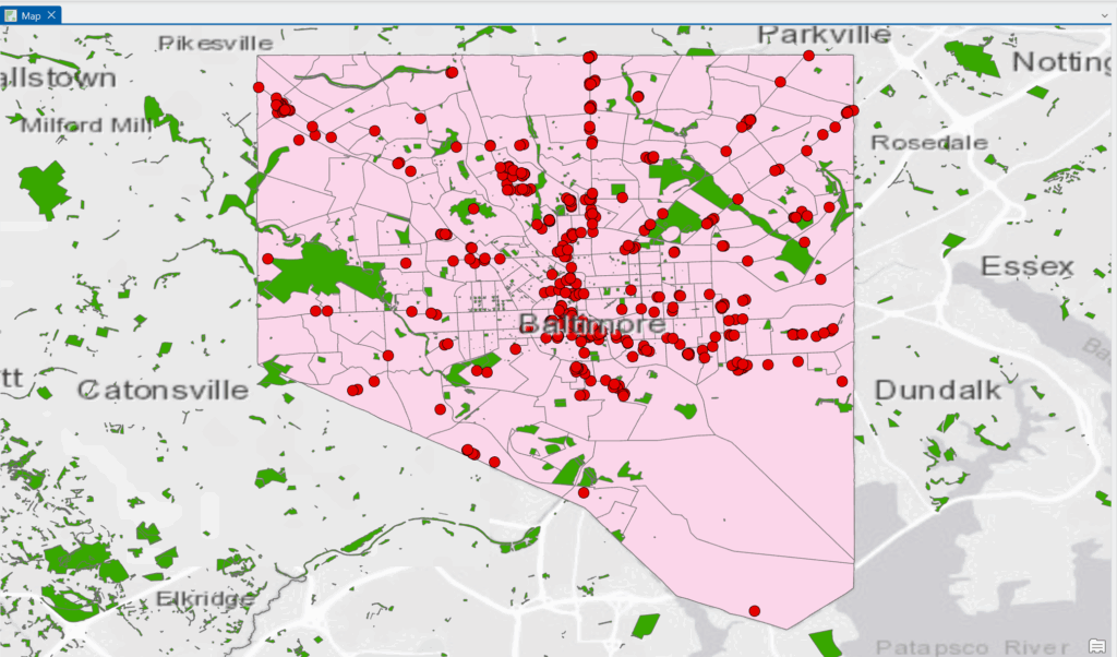
Below is a screenshot of the map for Baltimore that includes all the pieces above.
Green Polygons: parks and other green spaces
Red Dots: fast food restaurants
Pink Background: Census income data that still needs to be segmented into income levels